Why 'Shop by Color' Might Be the Most Valuable Spot on Your Shopify Store

Why Shop by Color Might Be the Most Valuable Spot on Your Shopify Store
I've abandoned a store because I couldn't find a color. Not the wrong size. Not a bad price. I knew the exact shade I wanted, the store had it somewhere in the catalog, and I gave up because the color filter dumped me into a maze. I'm supposed to be a Shopify guy, and even I bounced.
So when Bridger Hart and Carson Hart, the brothers behind Hoppn and its Infinite Color Search app, came on Shopify1Percent, I went in a little skeptical and left convinced that the boring little color filter in your sidebar is quietly leaking sales you can't even see.
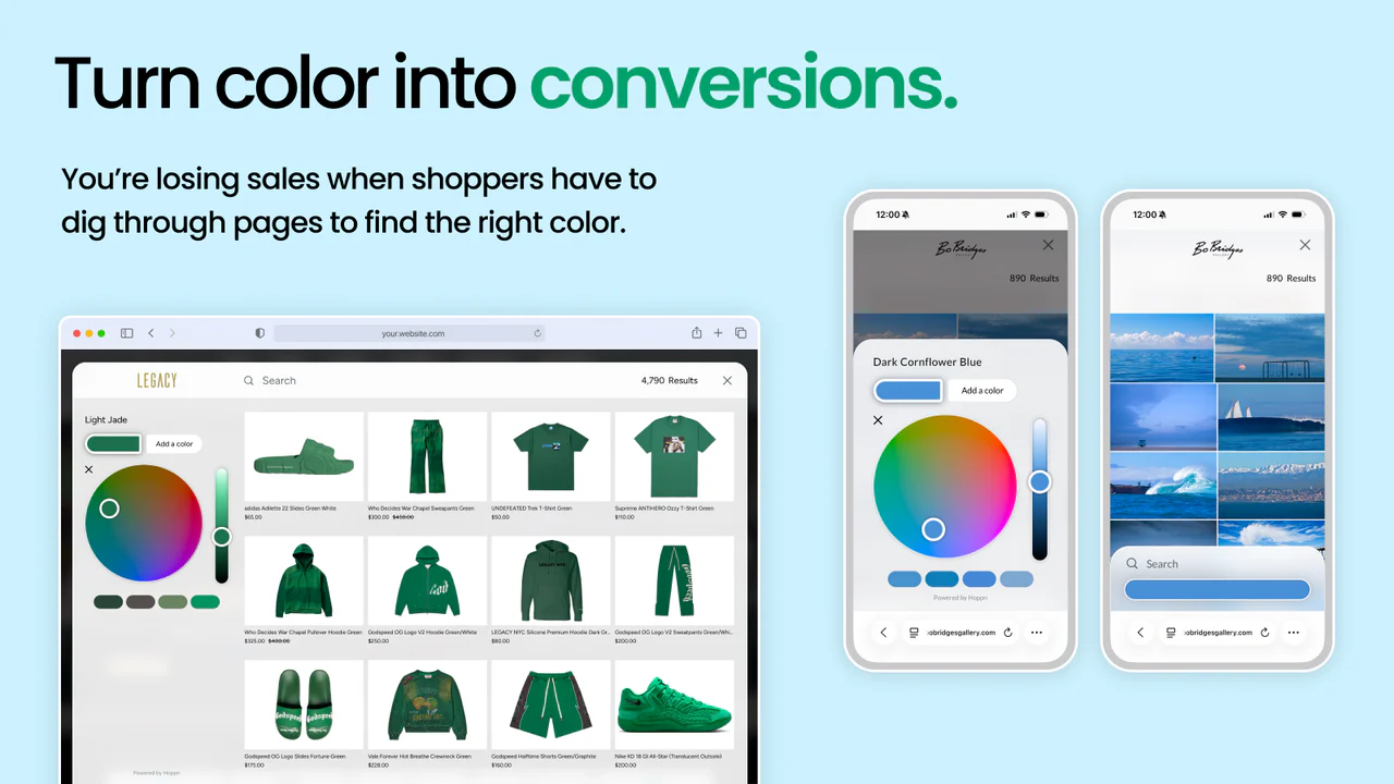
Short version: most Shopify color filters run on subjective names like "midnight sand" that have nothing to do with what shoppers actually want, so your best products stay buried. Hoppn's Infinite Color Search swaps named filters for a visual color wheel, using AI to read the real colors out of your product images. On the stores running it, Bridger and Carson report 1.6x bigger carts and a 3.5x conversion lift through the wheel.
Let me get into why this hit me harder than I expected.
Why doesn't "blue" ever show me everything blue?
Because the word "blue" is doing way too much work.
Color is one of the top three filters in all of ecommerce, and Bridger's point is that almost nobody does it well. You've got two bad options. Go generic, and you build a Crayola box: red, blue, green, done. Or go specific, and you end up with fifty filters where clicking "light blue" returns three products and a dead end.
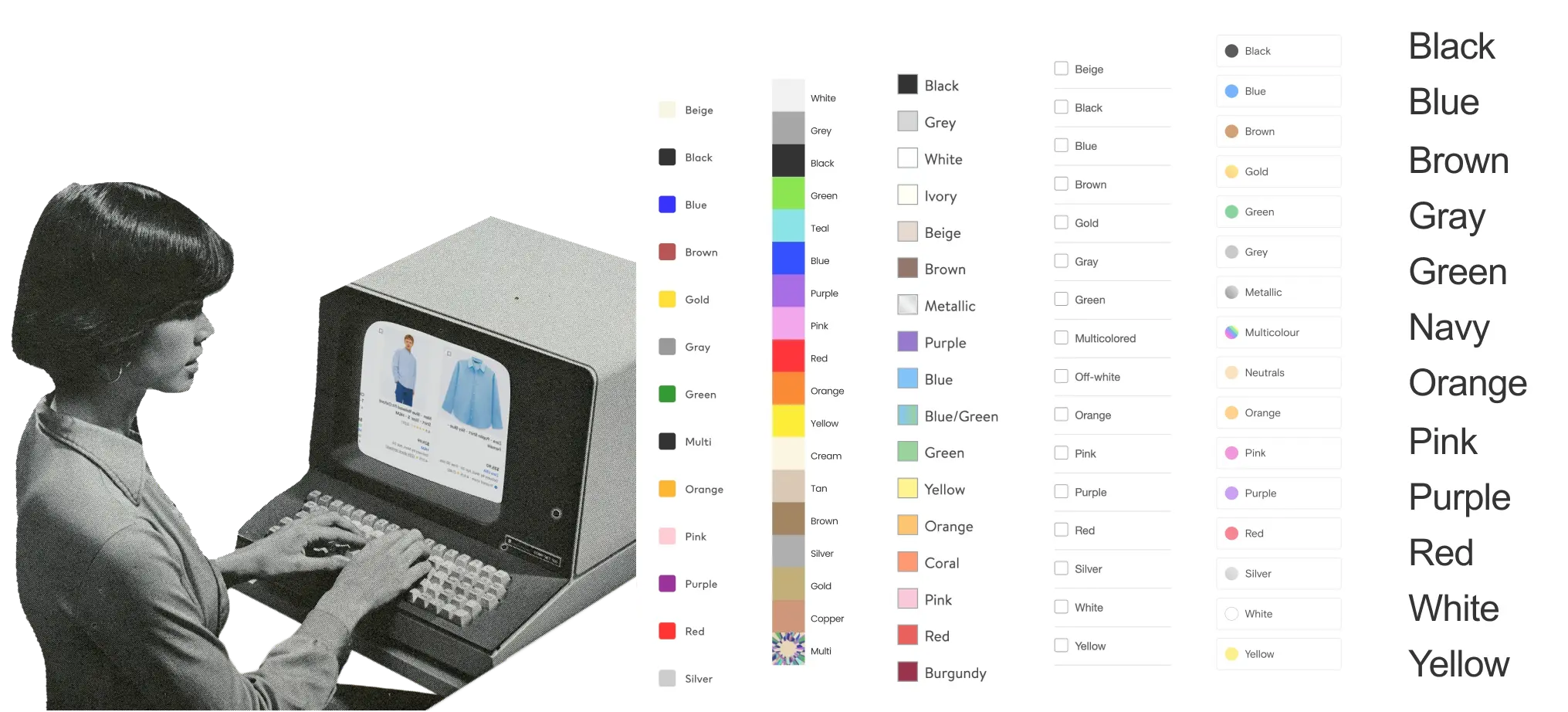
And the names are a mess. One brand calls it maroon, another calls it wine, a third calls it "midnight sand" (my personal pet peeve, by the way). Those are marketing names. They're great on a product page and useless as an actual filter, because the tag in your backend has nothing to do with the real color of the thing.
Here's the part that stuck with me. Bridger says brands quietly stop tagging colors over time. The manual work is just too much, so even a giant like Nordstrom will show you "blue" and silently leave out half their blue products. You're not seeing a catalog. You're seeing whoever remembered to tag that week.
That matters because color sells. Shoppers say color is the top reason they pick one product over another roughly 85% of the time (Parachute Design, 2026). And it cuts the other way too. Items that don't match the description drive 22 to 31% of returns, and a big slice of that is color looking different in real life (Synctrack, 2025). A broken filter doesn't just lose you the sale. It ships the wrong thing and pays for the round trip.
How do you search by color when a sneaker has five colors?

This was the question I actually came in with, and it's the cleverest part.
Most products aren't one color. A sneaker has a base, an accent, a sole, laces. A Hawaiian shirt might be 70% light blue with 30% yellow scattered through it. Hoppn's AI reads the product image, segments the actual product off the model and the background, and pulls out weighted color values for everything in it. Then the wheel ranks results by how close they are to what you picked, and by how much of the product is that color.
It even reads your title and description to figure out what the product is, so it works on messy lifestyle shots, not just clean studio backgrounds. The white shirt on the beach still gets read correctly, which matters more than ever now that AI is reading your product data too.
The moment that made me laugh was when Carson pointed at my shirt and Bridger's shirt and called them two different blacks. I said "this is black, come on." He was right, though. His carried more pigment, mine leaned darker, and a stylist hunting a specific black would treat those as completely different products. No dropdown on earth captures that. A color wheel does.
Is color actually a conversion lever, or just a nice-to-have?
The numbers Bridger and Carson put on the table are the reason I'd take this seriously.
Across their brands, the wheel drives 1.6x larger checkouts and a 1.3x lift in average order value. Conversion through the wheel runs 3.5x higher than the rest of the site. One of their best partners hit a 67x return. Those are their figures, said on the record, and they line up with where the wider data is heading: 36% of online shoppers had already used visual search by 2025 (TechAhead, 2025), and stores that add visual search see around a 29% conversion improvement on visually searched products (Gartner, via LaunchMyStore, 2025). Better yet, the same research pegs visual search at 12 to 18% fewer returns because shoppers know what they're getting (Syte, 2025).
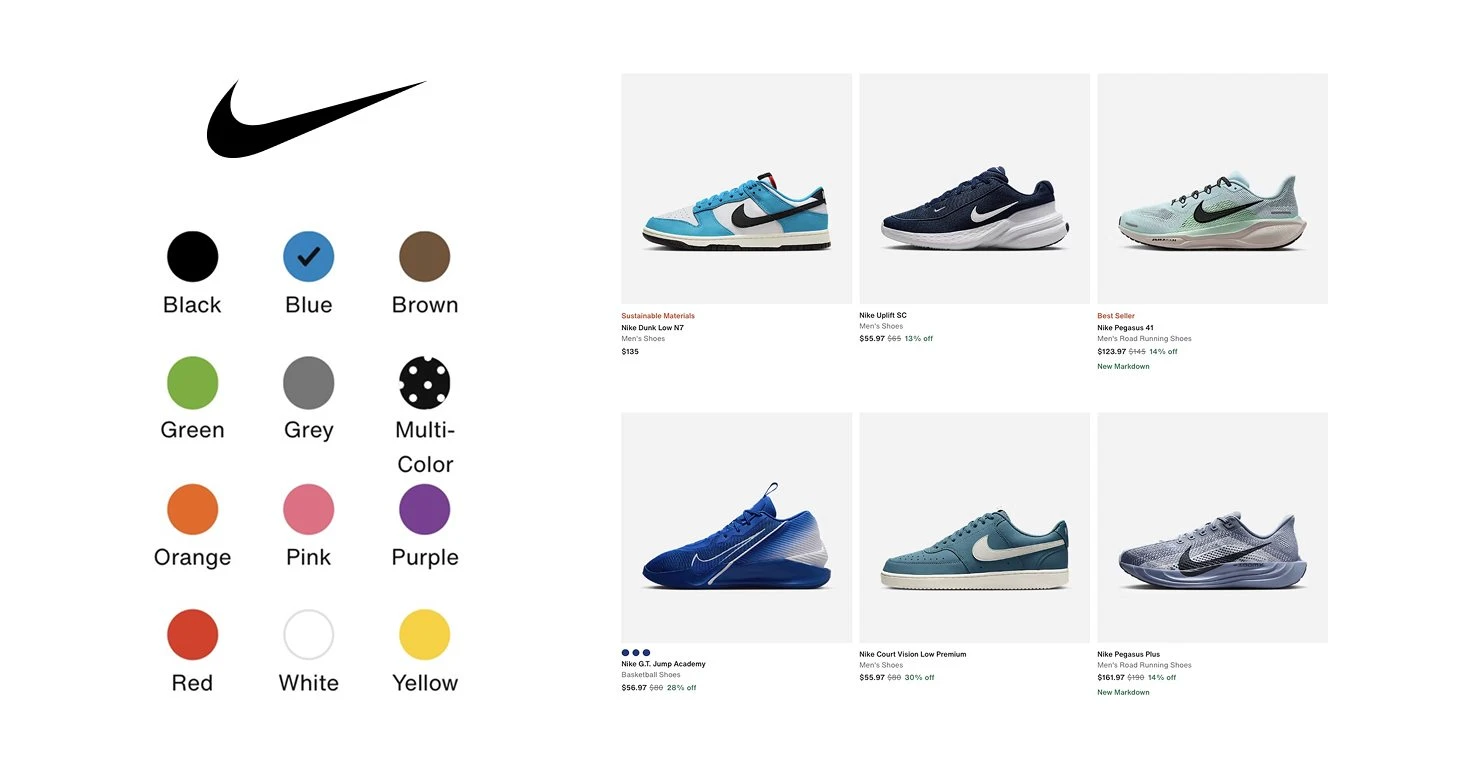
Here's the tell that convinced me. Nike puts its color filter above price and size. Adidas has a shop-by-color button right in the header. When billion-dollar brands give color the most expensive real estate on the page, they're telling you something.
I've got a rule about that. The only things that belong in your top nav are things that lead to money. Your "about us" page goes in the footer where it belongs. If Nike and Adidas are putting color up top, then for the right store, shop by color leads to money.
The data your store is already sitting on
This is the part brands sleep on.
Hoppn can show you the exact colors people search, down to the hex code, including the ones you don't sell. Picture seeing live demand for a specific teal you've never produced. That's a product roadmap handed to you by your own customers. Carson said some brands have already started making new colorways off it.
They also caught a great real-time moment. When the latest Stranger Things dropped and a character wore a Body Glove wetsuit (Body Glove is one of their partners), shoppers immediately went into the wheel searching that exact two-tone red-and-blue combo. You can watch culture move through a catalog in real time.
And honestly, it's just fun to use. I went on the Spyder Surfboards site before we recorded, started sliding the wheel, and kept going. Pick a color, see everything, nudge it, see something new. There's a little dopamine hit every time the grid changes, which is pretty much how the modern buyer's brain works. It works on yarn shops, art, home decor, wallpaper, anything where color is the whole decision.
That's also a marketing angle most store owners miss. I'd straight up email my list a color wheel and say "what color are you picking today?" No promo, no discount, just a reason to click back to the store and play.
Your 1% win this week
Go shop your own store by color, as a total stranger would.
Pick one specific shade you actually sell. A dusty sage, a particular navy, whatever. Now try to find it using only your current filters and search. Time yourself. Watch exactly where it breaks: the wall of mislabeled blues, the "3 results" dead end, the products you know you carry that never show up.
That broken moment is the money. Once you've felt it as a customer, you can't unsee it, and you'll either fix your tagging and filter logic or go look at a real visual color search like Hoppn's Infinite Color Search. One small audit, and you'll know whether color is quietly costing you.
Want the full conversation, including the bit where Bridger explains why color is actually three-dimensional? Listen to the episode on Shopify1Percent wherever you get your podcasts, and subscribe so you catch the next one.

Co-Founder @ Bold Commerce // Host Shopify1Percent
Jay Myers has been in the ecommerce game for over 25 years. First as a merchant, then a service provider, and today a software provider. His company, Bold Commerce, has helped over 800,000 online stores sell more on Shopify. Their suite of apps help brands maximize LTV (Customer LifeTime Value), and AOV (Average Order Value).
Bold has been ranked one of Canada's Top Medium Sized Employers, ranked in the top 50 fastest growing companies in Canada by Deloitte multiple years, a Top Growing Company in Canada by the Globe and Mail, and winner of the Ernst and Young Entrepreneur of the Year award.

Shopify Dropped 150 Updates. Here Are the 11 I'd Turn On, and the One That Matters Most